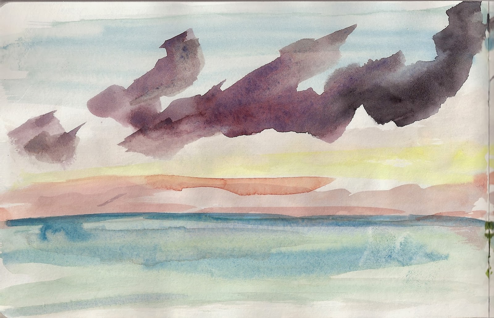
The view from my hotel room at the Barcelona W was not of the Mediterranean but of the bay (I know, poor me). It was interesting nonetheless, especially at sunset.
Watercolor 11 x 8.5 on heavy weight paper 270 gsm
This is bit more abstract than I initially intended and yet it still conveys to me the feeling of sunset.
I wish I had more time to sketch while there, but between work and the jet lag (and the protest marches), I did not have the time or energy. As I said before, Barcelona is a great city to sketch.
A quick and rough watercolor of my hotel room view in Mission Bay, San Diego. The location was not as convenient as being in the Gas Lamp, it certainly offered more picturesque vistas than my stay at the Manchester Grand Hyatt (see below). The clouds over the Pacific Ocean were quite spectacular.
Watercolor 5.5x8.5 on paper
View from Manchester Grand Hyatt (circa May 2015)
It is that time of year again. . .thinking about family, Christmas and then the Keys.
Trying to work more and get better using the"wet-in-wet" technique. The goal for this was to do a much more "atmospheric" and moody sky. I am still have having issues controlling the water to pigment ratio. I think the paper needs to be soaked more to really open up the fibers (which is tough to do with paper on block paper). That being said, I do like how the sky turned out, it is a bit more organic and flowing then previous skies I have attempted.
Watercolor on 140lbs watercolor block, 9x12
This is a large, 12x16 inches. I have been wanting to go "big" for a while, but taking photos of the larger paintings with my antiquated iPhone was not getting the job done. The new scanner is allowing me use my larger paper/pads. It is certainly freeing to be able to go big and use bolder brush strokes. Lots of layers of color here, especially on the horse (its anatomy got whacked a bit as a result, but I am fine with the end product).
Watercolor on 140lbs block 12x16
Another wonderful Key West vacation has come to an end. And what better way to reflect on an ending than with a sunset.
Watercolor on paper 5.5x12.25
The beaches of Key West are not quite the same destination as their northern cousins of Miami or Ft Lauderdale and as a result we tend to spend more time at the pool. However, we really wanted to see a sunset at Smathers Beach. I am happy with how the water/paint rolled down the page (when held vertical) to build the waves.
The dark green masses on the beach is the plethora of sea grass that
washed onto the shore. And if you look real close (click to embiggen), you can see the
actual sand from the beach that I accidentally spilled on the paper.
And above is a poor attempt to stitch both halves together to better show how
the paint ran down the paper to create cool looking waves.
These are really small, 3.5x5.5 inches, even smaller than postcards (4x6) but make for good practice. . With these, I was trying a few things out. I wanted to mix colors directly on the paper (wet on wet), glaze transparent washes over dried washes (wet on dry) and try out my new Lamy fountain pen.
This is my favorite one of the series below. It is the only one using ink. Unfortunately, the Lamy ink is not water proof, so the ink bled (which did create nice dark washes). I mixed the sky and clouds directly on the paper and you can see more color transition and gradation than I am normally able to achieve.
Mosquito Creek, Olympic National Park, WA
watercolor and ink on paper 3.5x5.5
I was a little impatient with this one and the color from the baby moose bled into the background, making it rather blurry. I mixed the trees in the foreground on the paper and when I did let the water dry, did several glazes of greens and browns on top to try and create the illusion of more distance. I think this one was semi-successful.
2 Moose, 1 Blurry, Isle Royale National Park, MI
watercolor on paper 3.5x5.5
The above two pictures used photo references while this one did not. I was very heavy handed with the water and flooded the paper. However, I really like the flows of color and the pigmentation that occurred organically as a result. The sky, clouds and foreground colors were all mixed on the wet, wet paper.
Golden Sunset (or Sunrise?)
watercolor on paper 3.5x5.5
Pastel painting is my true passion. While I am enjoying watercolor immensely, working in pastels is where I feel most expressive. Hard to believe it has been nearly a decade since I have painted a landscape in pastels and 2 years since this.
This is another Key West sunset, taken while on a Wine and Wind sailing tour. It was a great time and a perfect end to a wonderful day. I had debated about trying this sky in watercolor, but ultimately I felt I could do it more justice in pastels. Plus, my beautiful Unison pastels have sat neglected long enough.
What we call the beginning is often the end
And to make an end is to make a beginning.
The end is where we start from.
TS Eliot
Little Gidding
Pastel on paper mounted on board 16x20
The room set up and photo reference. Since I have flattened my high school easel for my watercolor work, I am using a table top easel for the pastels. I like this new set up as it allows me to paint in watercolor or pastels, without wasting time finding my tools. If you look closely, you will notice the sky in the photo is different from the final, I felt the color gradation was too jarring and needed to be softened.
A detailed close up of the setting sun. I blended some of the colors in the clouds to give them a more atmospheric look while left the strokes in the water rougher to show motion. Notice how the grain of the pastel paper peaks thru in some areas, but not in others.
This piece kinda got away from me. While in the keys, I took several photos of beautiful sunsets, some with deep oranges and yellow, some with soft pinks and reds, all with the intent of using them as the basis for studio pieces. This is the first such painting.
I wanted to add a bit more color to the water and may have overdone it a bit. Not sure, I go back and forth as to whether I like this or not. You all can decide. I am pleased, however, with how the sail boat turned out.
This is one of my larger watercolors at 12x16 as I am feeling more confident working bigger.
Watercolor on 140lbs watercolor block 12x16
Friday I posted the fauna and today is the flora (really they are just landscapes).
Like last year, the first night in the Keys I did a painting from the lanai. This is the view looking south, where as last year it was looking north. There were some really cool and unusual, almost vertical clouds, that hovered in front of the sun.
I was using a wet-in-wet technique (and I still have some trouble controlling my water). I used a little too much water on the right panel and the you can see how the color granulates (formation of pigment granules; see below). However, I liked how the colors ultimately flowed into each other and feel I captured the essence of that moment at sunset.
The First Sunset
watercolor on paper 5.5 x 16.50
And here is a more detailed look at each panel:
(Notice the how the orange and red in the sky begins to granulate as the color bleeds into the water)


.JPG)